GRE Prep Club Daily Prep
Thank you for using the timer - this advanced tool can estimate your performance and suggest more practice questions. We have subscribed you to Daily Prep Questions via email.
Customized
for You
Track
Your Progress
Practice
Pays
Not interested in getting valuable practice questions and articles delivered to your email? No problem, unsubscribe here.
US company ownership
[#permalink]
 Updated on: 11 Mar 2024, 16:32
1
Bookmarks
Question Stats:
 88% (01:38) correct
 11% (00:30) wrong
  based on 9 sessions
Hide Show timer Statistics
Attachment:
File comment: histogram

30652247_1640395482743380_8832395314154438656_n.jpg [ 675.55 KiB | Viewed 5484 times ]
30652247_1640395482743380_8832395314154438656_n.jpg [ 675.55 KiB | Viewed 5484 times ]
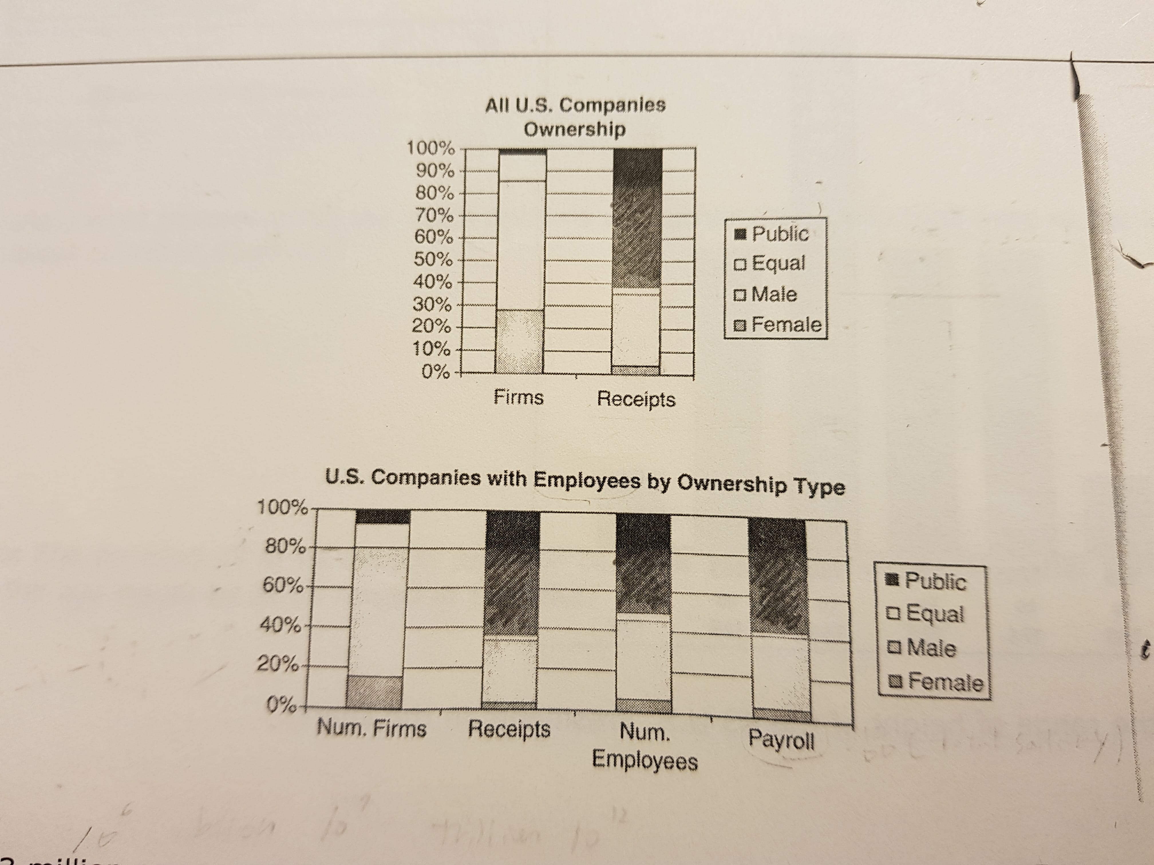
1.
Quantity A |
Quantity B |
Average receipts per female company |
Average receipts per male company |
2.
Quantity A |
Quantity B |
Average salary in public company |
Average salary in nonpublic company |
Answers: 1. B, 2. A
Sherpa Prep Representative
Joined: 15 Jan 2018
Posts: 147
Given Kudos: 0
Re: US company ownership
[#permalink]
 12 Apr 2018, 23:06
1
Expert Reply
Firstly, Sihyun, where did these graphs come from? These are some of the most obtuse and unclearly labeled graphs I've ever seen. Sometimes, if you're having trouble with problems that don't come from ETS, it's not your fault; it's the fault of whoever made the problem. Some companies produce decent problems, but many produce a lot of garbage. (In this problem, the top graph is labeled "All US Companies Ownership" but then one of the columns is labeled "Receipts." That has nothing to do with ownership. What does that even mean? Totally unclear. Also, what exactly is the difference between these two graphs? They both have that mysterious "receipts" column that seems to be identical in both. The second one is labeled "US companies with Employees." Does that mean the first one is US companies without employees? How do you have a company with no employees? What's the difference between "Firms" in the first and "Num. Firms" in the second? Especially since they're both labeled against a per cent column? I could ask more questions, but an ETS graph would never be like this. They might be complex, but they'd never be completely unclear. I guess the take away from all this is that you shouldn't waste your time with questions from whichever company came up with this atrocity. Switch!)
Anyway let's do our best. For your first question, I'd simply look at the receipts column and see that the section labeled male is much larger than that labeled female, so quantity B is larger.
For your second question, there is nothing labeled salary. But I suppose we could look at the "Payroll" column, which is badly labeled but apparently means total pay in the company. Then we can compare it with the "Num. Employees" column, which I suppose means the number of employees in the company. Then if we notice that the payroll of the public companies is larger than the number of employees in the public companies, we see that the payroll to employee ratio is greater than 1. "Nonpublic" isn't shown but it must be the rest of the companies. So we can see that the nonpublic payroll to nonpublic employees is less than 1. Thus A is greater. I guess.
How is it that the companies are either public or male-owned? How is this not an overlapping set? These graphs make me upset. Get different books, Sihyun!
Re: US company ownership
[#permalink]
 13 Apr 2018, 07:21
Expert Reply
Please reformat the question according to the rules
https://gre.myprepclub.com/forum/qq-how-to ... -2357.html
Thank you so much.
Regards
https://gre.myprepclub.com/forum/qq-how-to ... -2357.html
Thank you so much.
Regards


